What catches your eye in a sentiment? For me, it's the font. I love interesting, quirky, and beautiful fonts that enhance what the sentiment is saying. While I love a regular, classic typewriter font, I am also drawn to beautiful scripts and different fonts within one sentiment. Individual words can create fun looks when combined.
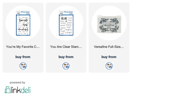
In today's card, I combined two sets from Whimsy Stamps: You Are and You're My Favorite.
I like how the script of wonderful, different than the first two words, seems to emphasize the meaning of "wonderful" even more, because it's a contrast!
My background was made with the Distress Inks. I used a strip of vellum in the middle to give a base for the sparkly ric rac and flowers, but I didn't want to cover up the background! I think it works well!
Stay tuned for next week's fabulous August release!


Very pretty Judy! I love your background! I don't normally like pink and blue together, but you are making a believer out of me.
ReplyDeleteThis is gorgeous Judy! Love the background and what a great way to use the vellum strip for the embellishments. Great fonts and you are so right, the wonderful really pops with the contrasting font.
ReplyDelete